Choosing the right Colour Scheme for your App

Choosing-the-right-Colour-Scheme-for-your-App

Each time a designer gets to designing an app, the first question that arises in their mind is what colour scheme to choose. Choices like these are usually pre made by their customers or they have to stick to the brand logo colours which are already decided beforehand. However, that is not always the case. Sometimes, the designer needs to be fully aware of how colours and colour schemes work while designing an app. Whether the app should have screaming colours or extremely dim and dull undertones is the choice an app designer has to make.

The right way to pick up the correct colours for your app is to first know the basics. You can be stuck with all the wrong colours at first, which you absolutely hate for your brand app. That is okay though. Creating an app is a process and choosing the right colours for your app is the part of the process. Knowing the right colour scheme for your app is as important as knowing the wrong colours. Trial and error are a part of the game.

The way you present your app and the kind of colours you use to make your app, leaves an impression on your app user’s mind. Choosing the right colour scheme for your app I an absolutely crucial stage of the app development process. The only thing that you have to keep in mind while this process is ongoing is that there is no easy way to choose the right colours for your app. The one thing that we can assure you is that the process is an exciting one.

We have mentioned a few crucial factors that will help you choose your app colour scheme with a lot of ease.

  • Colour Perception

Everybody perceives different colours differently. However, colour perception is connected with different individual characteristics of a person. There is a reason behind that association. Different colours trigger different emotions is individuals and therefore, people seem to react differently when they come in contact with these colours in their everyday life.

Choosing-the-right-Colour-Scheme-for-your-App

Colour psychology is an entire study which educates people about how humans perceive a set of colours and how you can use them in marketing to sell your product and app services. For example; White is always representing peace and tranquillity while blue is representing trust and faith. You can choose a colour for your app depending on what kind of a response you want from your audience.

  • Using Different Colour Tones

Making your app look extremely uniform and eye catching for your users is no rocket science. You can choose a primary colour for your app and then add additional colour shades of that primary colour in order to make the entire app interface look a lot more appealing for your online audience. You can strategically use colour shades for your app and save your entire app from looking loud and disturbing to the eye.

If you need to use different colours for your app apart from the standard primary shade, you can go in for subtle mid tones or black and white. This will give your app a smooth transition and your colour tones will fall in place very organically.

  • Target Audience

Who your app is targeting is a very crucial aspect you need to keep in mind before selecting a colour tone for your app. This is because, every individual as a different way of perceiving colours and colour tones. In some parts of the world, ed is considered as a colour which represents passion while in the other parts of the world the colour red is a representation of wealth and prosperity. This is why, when you make an app you need to make sure who you are targeting in order to get your colour scheme right.

Not only the geographical location, but also the age, gender, and other demographics are very important to know before you set up your final colour scheme for the app.

  • Originality

Being original is the key to creating a successful app using the right colours. Most of the times designers opt to be safe and play with monochromatic colours while making an app. The best apps are made only when app creators dare to do something out of the box and be original.

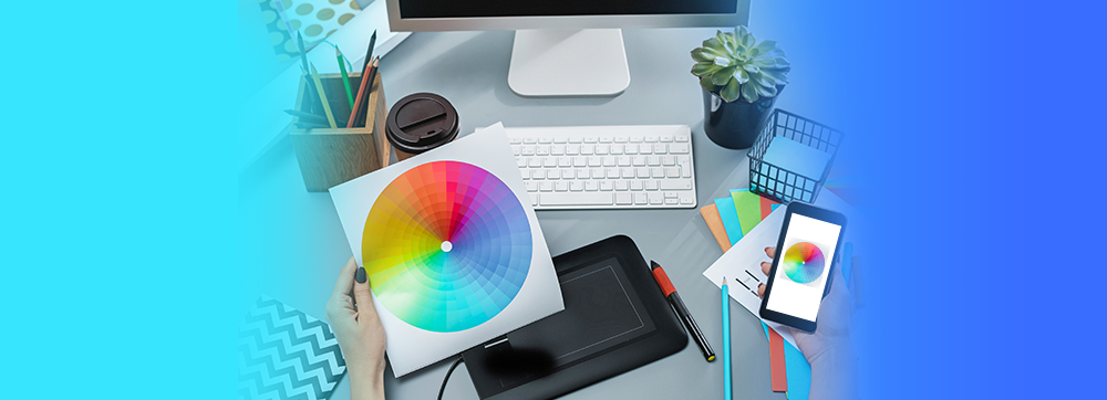
If your original customer scheme does not work out towards the end, you can always change your design colours. That is absolutely nothing to worry about, It is not something that is irreversible. However, choosing something unique and original is sure to give your app a chance to make it big. If you are an app creator who is looking to form the best colour scheme for their app, we dare you to be daring and go against the basic, safe colour schemes that most app creators opt for.

  • Colour Restrictions

Using a limited number of colours and elements is always the right choice to make while creating an app. If you put in too many colours in your app design, to might just end up disturbing the user’s eye and they will not want to use your app any further. Too much of anything is dangerous and that stands true even when you are deciding the colour scheme for your app. An app creator should always stick to a limited umber of primary and secondary colours while designing an app. These colours can either be of one tone or have several mid tones. Going too much on the number of colours while making your app is not advisable

Choosing the right Colour Scheme for your App

Everything that is a part of the app creating process is as important as a ready app as a whole. If you have not made an app for your business yet, what are you waiting for? Start using the ON AIR App Builder and make an app using the right colour scheme. Try Now!


Cookie Consent with Real Cookie Banner